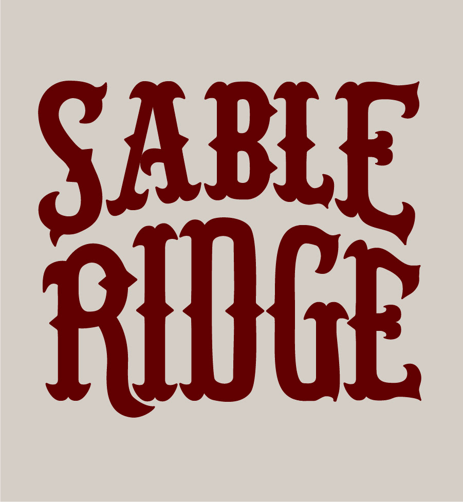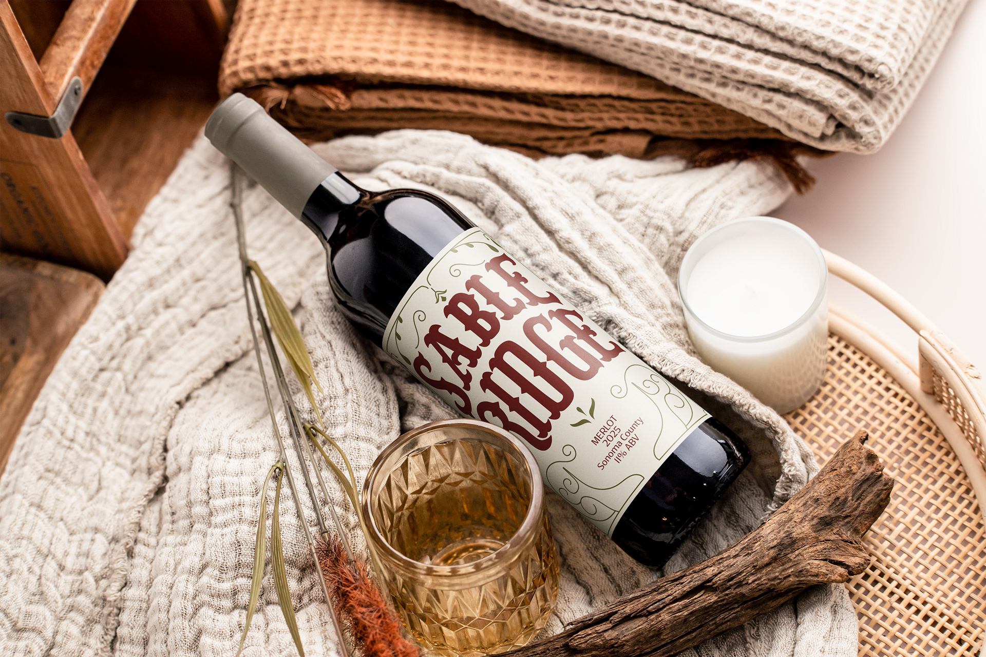
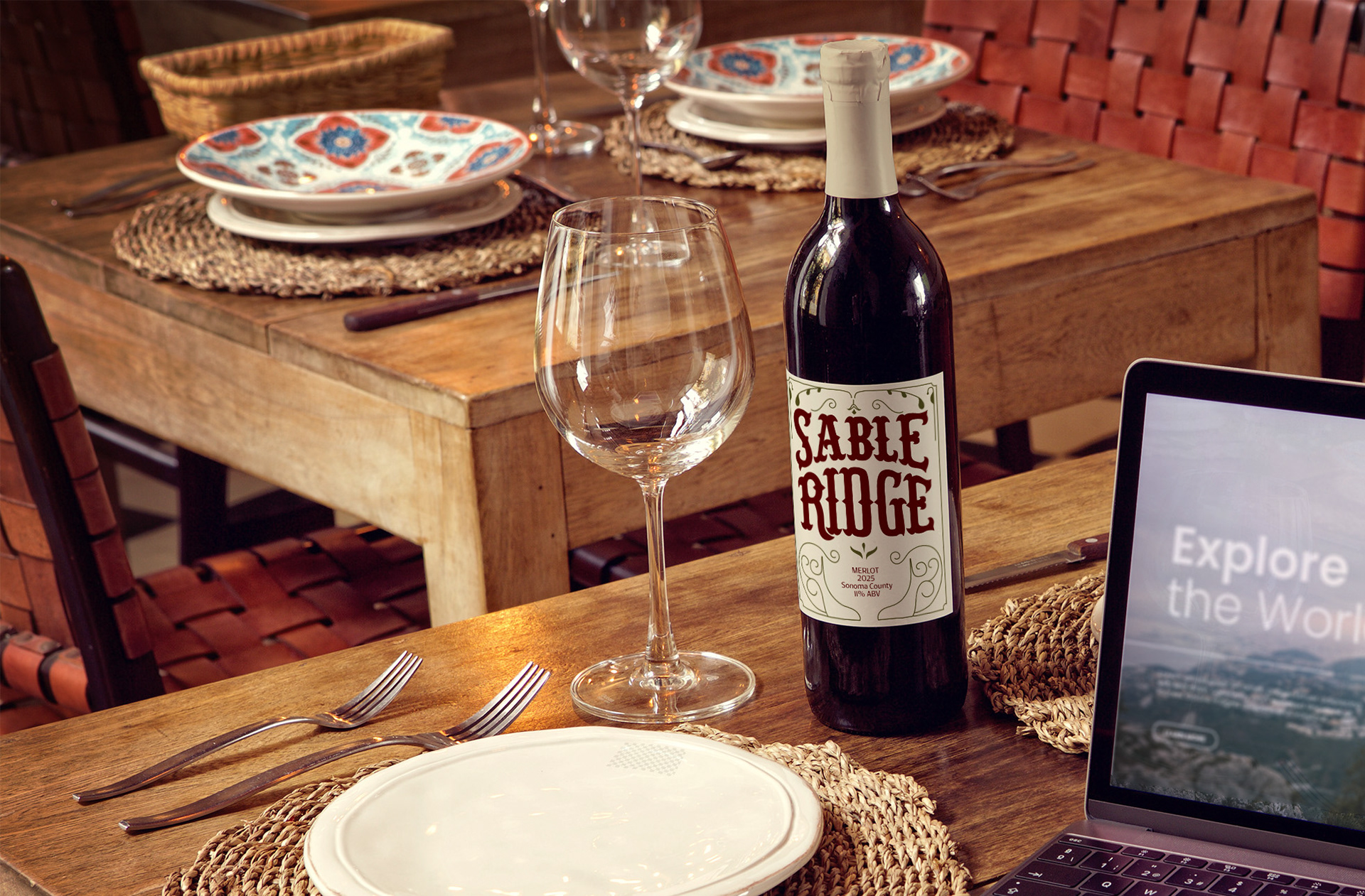
Handlettering
I decided to design the label with a typographic approach through hand-lettering art. I focused on drawing the letters to give me more freedom in style and layout of the overall label.
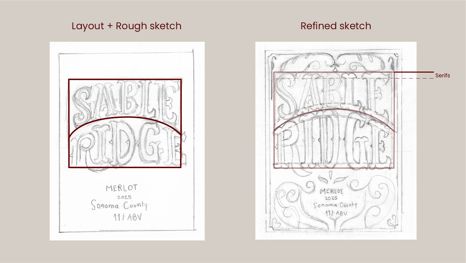
Layout and Sketching
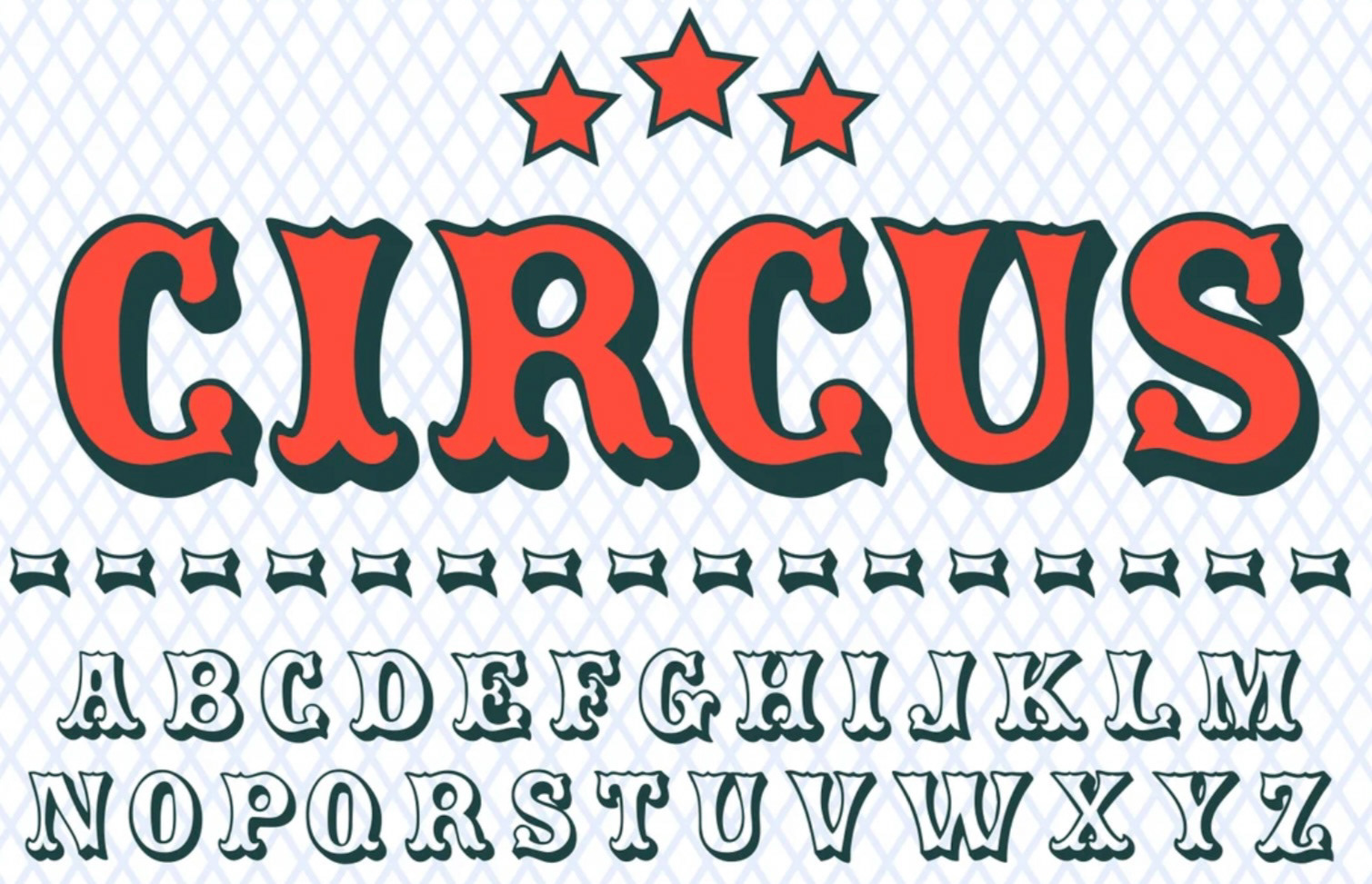
Using the box method I drew arc shaped boxes to build the layout of the lettering design. Then refined the sketch by drawing the letters inspired by the circus font. The use of guides helped me being consistent in the letterforms.
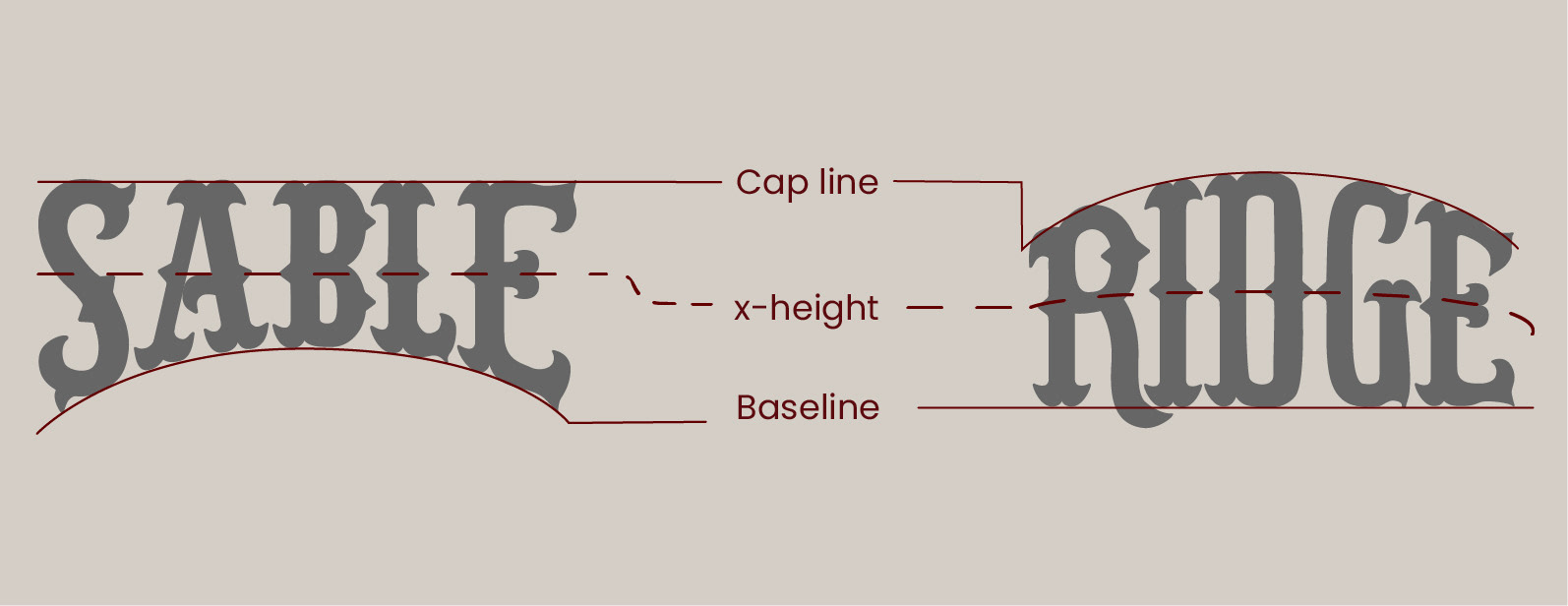
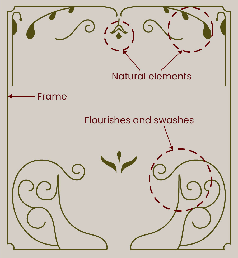
The use of decorative elements combined with the hand-drawn letters strengthen the composition and draw the audience eye's to the name of the wine.